In what ways does your media product use, develop or challenge forms and conventions of real media products?
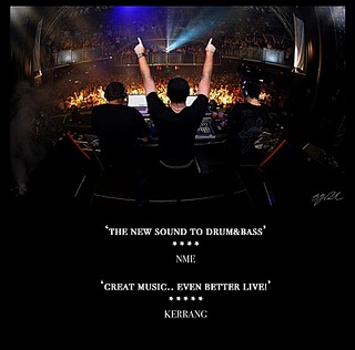
Before producing our music video we analysed existing products in order to gain knowledge of the conventions that are used in the music indusrty. By gaining this knowledge it enabled us to both use them in order to connect with our audience and also challenge them in order to make our video stand out from the rest and make it stick in the viewers mind. One of the first conventions of the drum ans bass genre is that there is often use of alcohol and sometimes drugs in the corresponding music videos. This is due to the fact that the target audience can relate to this behaviour as stereotypically they partake in such activities on a typical night out whilst listening to this genre of music. Therefore we decided to include drug and alcohol use in our own video to attract the target audience. We decided that we would use this behaviour as a cause for the main characters demise which recipricates real life consequences. This was heavily influenced by The prodigy video of 'Sma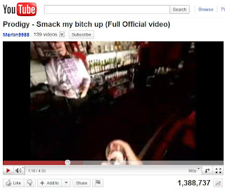 ck My Bitch Up'. The image from the video on the left shows the character drinking recklessly and the outcome is not favourabke. By using this convention the audience is familiar with what they are seeing and can identify it as a piece to which they are interested in.
Furthermore during our research we soon realised that to create and edgy piece and convey the characters life spiralling out of control we had to make sure that the majority of our shots were made with the camera being unsteady. This is common in drum and bass videos as the movement of the camera has strong links to the music that is being played. If the camera movement was very still and controlled then the audience would feel as though the situation they are watching unfold will also be under control, which is not what we wanted to portray. Furthermore the pace of the music would not fit and therefore it would be hard to engage our audience and make our video memorable. Also by using unsteady camera shots and combining that with fast paced editing we were able to create a lot more tension in the narrative and therefore the audience can put themselves in the same situation and feel how the character feels in the video. This helps the audience feel as though this video can teach them how to handle situations of adversity and realise this is not the way, leaving a lasting impression on the audience making the video hard to forget. Furthermore the more action that is going on at a fast pace the more likely that the audience will not get bored. The situation changes often in our video and the audience are kept right on the edge of their seat through the pace of the action, they are lead to believe that the character is heading in the right direction before the tragic end which puts an extra interest into our video as the audience are touched emotionally by the death of the main character. We also felt it was necessary to match the pace of the editing exactly to that of the music so that when it slows down so does the pace of the editing. This is in order for the audience to follow the story smoothly and allow them time to digest what they see as the story goes on. This is a feature I found common in the music videos I analysed therefore we used it in our video. Also at the start of every music video the band name and song title come up on the screen so naturally we chose to do this to make our video look professional. Also as i identified in the Coldplay video i analysed when the song is trying to convey a sad meaning and the mood is rather sombre you rarely see bright flamboyant costumes and scenery. The mood in 'the scientist' is similar to our trailer so we followed the same style and kept the characters costume subtle as well as the choice of location. One of the conventions that we challenged in our genre was that most drum and bass videos do not have a strong narrative to them. We decided to give our video a very clear narrative in order to captivate our audience and make our piece original. By doing this the audience can see how the song reflects the predicament our main character is in and how the mood reflects this. With most music videos in this genre you often simply see people enjoying the song being performed live at a gig and therefore there isnt anything the audience sees that engages them emotionally. This is shown in the original video for the song. This type of shot would be difficult for us to achieve as there wouldnt be a location or the manpower to carry out such a shot. Moreover another way in which we challenged conventions was that we ensured the the narrative was clearly related to the lyrics of the song. This is very uncommon in the genre as there are very rarely many lyrics to link a narrative to but our decision was based upon the fact we wanted to engage the audience on a personal level and allow them to use our piece as a way of aiding them in their own life. This connection that we aim to make with the audience allows the video to stick in their heads and appeal to a wider variety of people. I believe that we used the core conventions of the drum and bass genre to make it clear that this was the audience we were appealing to, but took it one step further by giving the audience something extra than just music. Making our media product more original and influential.
How effective is the combination of your main product and ancillary texts?
We were keen to encourage a common theme throughout our music video and our promo pack in order for the audience to recognise the affiliation between the two. As we are appealing to a younger audience the design of the promo pack is edgy and minimilistic. We used dark colours in order to convey the depair and sombre mood of the narrative and also the lyrics of the song. This is also reflected in the video which allows the audience to immediately identify what they are about to see. Furthermore in order to make the cover seem more modern and trendy we used an effect around the edge of the image to make it seem worn. This represents the image being cool and a youthful modern image. This represents our target audience as they are m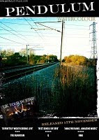 ainly interested in the quality of the music and do not need a persuasive image to inspire them to listen to the song or watch the video. This is why we aimed for a minimilistic theme as we are simply trying to say we are about the music too. Furthermore after reviewing existing products we felt that the power of reputable reviews shown on a CD cover reiterates the quality of the music and therefore allows the target audience to pick this out as something they are interested in whilst drawing in a wider audience through fans of those who reviewed the song. By making the promo pack simple in design and the story of the video relatively easy to follow albeit the surprise at the end it gives the products more of a professional feel and epitomises the theme of less is more. We let the music speak to the audience as this is what they are interested in. This common theme is what makes the combination of the two complement each other and also allows them to draw in the audience.
What have you learnt from your audience feedback?
The feedback we recieved from our target audience helped shape the structure and the content of both our video and our promo pack. We aimed our questionnaire at both male and female individuals aged 18-24 as this was our main target audience. One of the main points that we grasped from our research was that it was essential for the timing of the editing and the pace of the song were matching in order for the story to be easy to follow. We found that most found the song overpowering when faster than the transition between shots particularly in the drug dealing scene. This would dampen the meaning of the narrative and therefore could lose the connection with the audience so it was key for us to change this, something we did. Furthermore our research showed that females connected more with the narrative than males which was to be expected. It is very important that the audience can empaphise with how the main character is feeling after being left by his partner in order to find the piece memorable and we saw that this was more achievable with the female respondents. One of the most positive feedback we recieved was that we conveyed how the protagonist was being affected by the drink and drugs very convincingly as the resonse to how we maintained a balance between showing he was intoxicated whilst not making it seem unrealistic. It was important for us to emphasise the effect that the narcotics had on our character to illustrate the harm they cause and the danger they possess. For us to know that we made an impact with this let us know that we had achieved our goal of connecting with the audience in the way that they know not to handle a similar situation in this way. Also we learnt that needed to make it slightly more apparent that the main characheter was homosexual. This referred to the scene where we see his ex love interest with a girl. We found some thought it was unclear who the love interest was and the twist seemed slightly unconvincing. However due to lack of time we could not put further emphasis on this, it was a small minority who flagged this as an issue therefore we felt it wasn't necessary to make drastic changes as we still wanted his sexuality to come as a great shock to the viewer.
How did you use media technologies in the construction and research, planning and evaluation stages?
The main piece of technology we used during the whole process was the online blog to show our research and planning and the finished product. The blog was used as a documentation of the steady progress made over a period of time illustration how each decision was planned and then produced in order to create the finished product. It was exactly the same method we used in our AS coursework so we were familiar with the technology. It is a much more efficient way of planning your work and to track progress than using a folder. Furthermore when researching existing texts youtube was a very useful tool. It enabled us to find all the videos to analyse in order to gain knowledge of all the conventions of our selected genre. It also allowed us to upload our finished product onto youtube and then by embedding the code posting them onto our blogs. It was very helpful whilst illustrating examples of the conventions we found as the video can be paused a print screened onto my b log in order to show what i was talking about.
Another key bit of technology we used was the Mac computer. This handled everything such as posting our progress onto blogspot to editing the raw footage we shot. I have worked with the mac since my GCSE and it is a very quick and efficient way to edit our footage and also edit the images for the promo pack. The software that we used to edit our footage was Premier Pro CS4. This was a new bit of technology for me and we were instructed by our teacher how to use all the tools to cut footage and add in special effects etc. The software was easy to use and allowed us to edit all our footage quickly and also cut the length of our song which was more difficult to keep it in time with the editing. We found putting in effects very useful after much experimentation. The use of the software taught us that we had to film far more than we first realised and that most of the footage we shot we didnt even use. After many weeks we had created our finished piece whilst using this software. The equipment we used for filming was a Handheld video camera, the charger and also a tripod. The tripod whilst useful for still shots was not necessary for all of our filming as we wanted the camera to have a lot of movement in most scenes to portray the choas unfolding. We were given instruction on how to use the equipment as this was new territory for all of us.
 ck My Bitch Up'. The image from the video on the left shows the character drinking recklessly and the outcome is not favourabke. By using this convention the audience is familiar with what they are seeing and can identify it as a piece to which they are interested in.
Furthermore during our research we soon realised that to create and edgy piece and convey the characters life spiralling out of control we had to make sure that the majority of our shots were made with the camera being unsteady. This is common in drum and bass videos as the movement of the camera has strong links to the music that is being played. If the camera movement was very still and controlled then the audience would feel as though the situation they are watching unfold will also be under control, which is not what we wanted to portray. Furthermore the pace of the music would not fit and therefore it would be hard to engage our audience and make our video memorable. Also by using unsteady camera shots and combining that with fast paced editing we were able to create a lot more tension in the narrative and therefore the audience can put themselves in the same situation and feel how the character feels in the video. This helps the audience feel as though this video can teach them how to handle situations of adversity and realise this is not the way, leaving a lasting impression on the audience making the video hard to forget. Furthermore the more action that is going on at a fast pace the more likely that the audience will not get bored. The situation changes often in our video and the audience are kept right on the edge of their seat through the pace of the action, they are lead to believe that the character is heading in the right direction before the tragic end which puts an extra interest into our video as the audience are touched emotionally by the death of the main character. We also felt it was necessary to match the pace of the editing exactly to that of the music so that when it slows down so does the pace of the editing. This is in order for the audience to follow the story smoothly and allow them time to digest what they see as the story goes on. This is a feature I found common in the music videos I analysed therefore we used it in our video. Also at the start of every music video the band name and song title come up on the screen so naturally we chose to do this to make our video look professional. Also as i identified in the Coldplay video i analysed when the song is trying to convey a sad meaning and the mood is rather sombre you rarely see bright flamboyant costumes and scenery. The mood in 'the scientist' is similar to our trailer so we followed the same style and kept the characters costume subtle as well as the choice of location. One of the conventions that we challenged in our genre was that most drum and bass videos do not have a strong narrative to them. We decided to give our video
 a very clear narrative in order to captivate our audience and make our piece original. By doing this the audience can see how the song reflects the predicament our main character is in and how the mood reflects this. With most music videos in this genre you often simply see people enjoying the song being performed live at a gig and therefore there isnt anything the audience sees that engages them emotionally. This is shown in the original video for the song. This type of shot would be difficult for us to achieve as there wouldnt be a location or the manpower to carry out such a shot. Moreover another way in which we challenged conventions was that we ensured the the narrative was clearly related to the lyrics of the song. This is very uncommon in the genre as there are very rarely many lyrics to link a narrative to but our decision was based upon the fact we wanted to engage the audience on a personal level and allow them to use our piece as a way of aiding them in their own life. This connection that we aim to make with the audience allows the video to stick in their heads and appeal to a wider variety of people. I believe that we used the core conventions of the drum and bass genre to make it clear that this was the audience we were appealing to, but took it one step further by giving the audience something extra than just music. Making our media product more original and influential.
How effective is the combination of your main product and ancillary texts?
We were keen to encourage a common theme throughout our music video and our promo pack in order for the audience to recognise the affiliation between the two. As we are appealing to a younger audience the design of the promo pack is edgy and minimilistic. We used dark colours in order to convey the depair and sombre mood of the narrative and also the lyrics of the song. This is also reflected in the video which allows the audience to immediately identify what they are about to see. Furthermore in order to make the cover seem more modern and trendy we used an effect around the edge of the image to make it seem worn. This represents the image being cool and a youthful modern image. This represents our target audience as they are m
 ainly interested in the quality of the music and do not need a persuasive image to inspire them to listen to the song or watch the video. This is why we aimed for a minimilistic theme as we are simply trying to say we are about the music too. Furthermore after reviewing existing products we felt that the power of reputable reviews shown on a CD cover reiterates the quality of the music and therefore allows the target audience to pick this out as something they are interested in whilst drawing in a wider audience through fans of those who reviewed the song. By making the promo pack simple in design and the story of the video relatively easy to follow albeit the surprise at the end it gives the products more of a professional feel and epitomises the theme of less is more. We let the music speak to the audience as this is what they are interested in. This common theme is what makes the combination of the two complement each other and also allows them to draw in the audience.
What have you learnt from your audience feedback?
The feedback we recieved from our target audience helped shape the structure and the content of both our video and our promo pack. We aimed our questionnaire at both male and female individuals aged 18-24 as this was our main target audience. One of the main points that we grasped from our research was that it was essential for the timing of the editing and the pace of the song were matching in order for the story to be easy to follow. We found that most found the song overpowering when faster than the transition between shots particularly in the drug dealing scene. This would dampen the meaning of the narrative and therefore could lose the connection with the audience so it was key for us to change this, something we did. Furthermore our research showed that females connected more with the narrative than males which was to be expected. It is very important that the audience can empaphise with how the main character is feeling after being left by his partner in order to find the piece memorable and we saw that this was more achievable with the female respondents. One of the most positive feedback we recieved was that we conveyed how the protagonist was being affected by the drink and drugs very convincingly as the resonse to how we maintained a balance between showing he was intoxicated whilst not making it seem unrealistic. It was important for us to emphasise the effect that the narcotics had on our character to illustrate the harm they cause and the danger they possess. For us to know that we made an impact with this let us know that we had achieved our goal of connecting with the audience in the way that they know not to handle a similar situation in this way. Also we learnt that needed to make it slightly more apparent that the main characheter was homosexual. This referred to the scene where we see his ex love interest with a girl. We found some thought it was unclear who the love interest was and the twist seemed slightly unconvincing. However due to lack of time we could not put further emphasis on this, it was a small minority who flagged this as an issue therefore we felt it wasn't necessary to make drastic changes as we still wanted his sexuality to come as a great shock to the viewer.
How did you use media technologies in the construction and research, planning and evaluation stages?

The main piece of technology we used during the whole process was the online blog to show our research and planning and the finished product. The blog was used as a documentation of the steady progress made over a period of time illustration how each decision was planned and then produced in order to create the finished product. It was exactly the same method we used in our AS coursework so we were familiar with the technology. It is a much more efficient way of planning your work and to track progress than using a folder. Furthermore when researching existing texts youtube was a very useful tool. It enabled us to find all the videos to analyse in order to gain knowledge of all the conventions of our selected genre. It also allowed us to upload our finished product onto youtube and then by embedding the code posting them onto our blogs. It was very helpful whilst illustrating examples of the conventions we found as the video can be paused a print screened onto my b
 log in order to show what i was talking about.
Another key bit of technology we used was the Mac computer. This handled everything such as posting our progress onto blogspot to editing the raw footage we shot. I have worked with the mac since my GCSE and it is a very quick and efficient way to edit our footage and also edit the images for the promo pack. The software that we used to edit our footage was Premier Pro CS4. This was a new bit of technology for me and we were instructed by our teacher how to use all the tools to cut footage and add in special effects etc. The software was easy to use and allowed us to edit all our footage quickly and also cut the length of our song which was more difficult to keep it in time with the editing. We found putting in effects very useful after much experimentation. The use of the
 software taught us that we had to film far more than we first realised and that most of the footage we shot we didnt even use. After many weeks we had created our finished piece whilst using this software. The equipment we used for filming was a Handheld video camera, the charger and also a tripod. The tripod whilst useful for still shots was not necessary for all of our filming as we wanted the camera to have a lot of movement in most scenes to portray the choas unfolding. We were given instruction on how to use the equipment as this was new territory for all of us.


 The first most noticable thing about this digipak is that it is fairly simple. On the front cover only one image is used and therefore is the main focus. It is given more space and emphasis than the name of the band which is highly unusual as it is the bands name that sells the CD. The same image is used on the back cover but with a decreased opacity to make the song titles stand out. The colours used are quite vibrant and therefore catch the eye of the audience and represents their interests. Another significant thing to mention is that the actual band, Pendulum is not featured in the digipak. This is a common covention with the drum&bass genre. This digipak is fairly simple but still effective. The design suggests that the band is not necessarily important and that it is simply the music that carries this through with the fans which is something we will look to address in our own design. There are also the usual formalitites that you see on any cover, the company logos and the barcode. Conventions like this will make our back cover appear more realistic.